UX, UI, these terms have been repeatedly described and explained, but what about IxD, Interaction Design? Yes, another technological acronym to remember, but don’t worry, we’ll make your life easier by explaining it through an awesome example!
The golden rule: Usability
While all agree on the principle, the description of usability varies from one source to another. For our part, we stick to these 3 elements:
- Learnability
- Efficiency
- Satisfaction
Just for Laughs: a strong case!
For the 2016 Festival, MultipleMedia handled the complete overhaul of the website. What could be better than this clear example to illustrate the principle of interactive design which guided the design of the project?
Far from being all beauty and no brains, hahaha.com’s main focus is on user experience. The best of work and play, right?
Innovation is not starting from scratch
We are not reinventing the wheel. What interests us is to build on something that works and bring it to the next level.
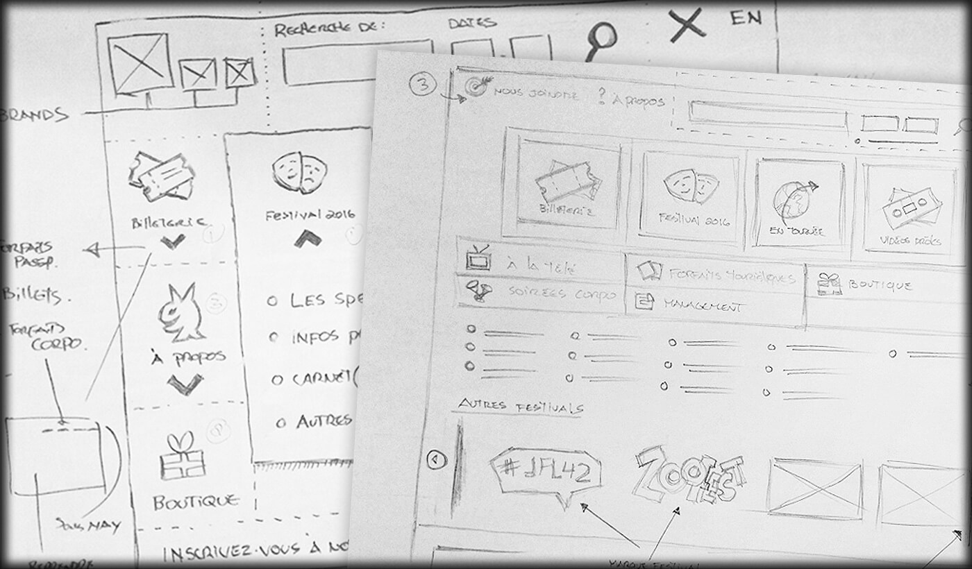
For JFL, one of the key elements is a flexible navigation menu editable through the client’s CMS. The challenge: it had to exist in two simultaneous incarnations, French and English, which are not carbon copies. Everything had to unify features as much as the brand.
We got inspired by adobe.com. What worked for us was first the fact that the menu is completely independent of the site without detracting from the experience. Mobile friendly too, it was clear that this would be an excellent starting point.
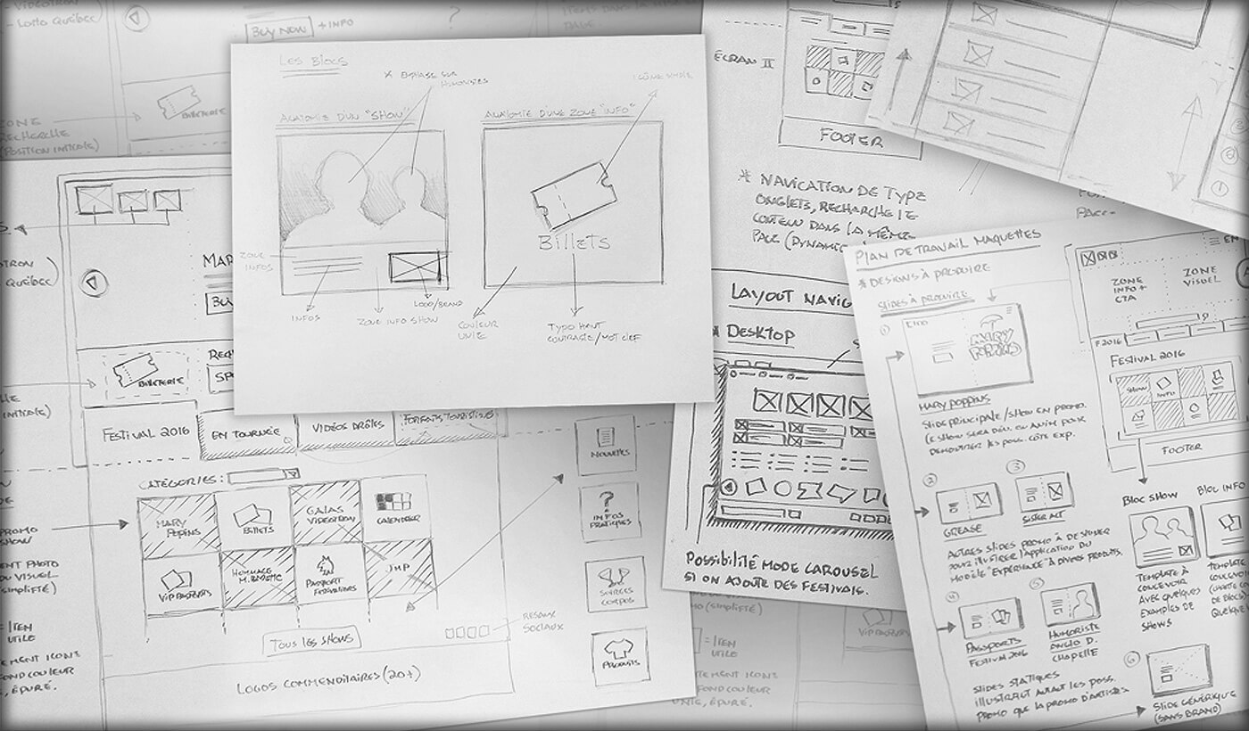
Inspiration gives way to innovation: organization and prioritization of information had to change. We quickly developed a system of “priority rows”, building icons to illustrate each section. Large icons distinguish sections of the first row. For the second, smaller ones suffice while the third row is reserved for quick links.
This system gave us the essential flexibility mentioned earlier, given that the two languages of the site were displaying neither the same content nor the same order.
Learnability
How much time do your users need to understand your website? Is the navigation intuitive?
To offer a maximum visibility to the different website sections while promoting the cohabitation of the corporate and Festival sites, the navigation has been completely redesigned to be more intuitive.
It has been divided into 3 levels.
-
The “hamburger” menu
Inspired by the common mobile menu, the first level of navigation is streamlined to the maximum. It almost leaves 100% of the space to content, including the home page animation, while still being easily accessible.
-
The five sections
Always in the context of usability, the secondary level appears at the lower part of the screen, thus completing the full screen experience. This menu takes the user to the five main sections of the site.
-
The checkerboard
Then, the last level which is repeated in several sections (reception, artists) includes interchangeable blocks leading to detailed pages. Navigation by categories also allows the selection of blocks on display.
Efficiency
According to the source, we speak of understandability or efficiency. In other words, the design must be conceived so that the user can quickly perform its task. A well-understood interface minimizes the user’s frustrations.
We’re not inventing anything; users are accustomed to certain interactions:
- Change of style on the hover of a button
- Enhanced selected section vs other attenuated elements
- Additional content on the hover of specific blocks
By focusing on visual consistency, intuitive interactions and best recognized usability standards through its design, MultipleMedia ensured an optimal understanding of the interface by hahaha.com users.
Work for Victor
Before even accessing the home page and its content, you are greeted by none other than the well-known Festival mascot, Victor. Personifying the Just for Laughs brand, who better to help you in your online journey?
Whether to entertain you while you wait for an animation to load, to indicate in which section you are in or which passport (tickets) is the best for you, Victor now has a main role in the Just for Laughs online experience.
The role of Victor in navigation:
When developing the Mega menu, we came to the idea of integrating a Victor in each section. Given that the customer has a wide bank of Victors illustrating various concepts; it was an obvious choice to give them a role in the site!
The “Customize and Save” tool
Victor directs you to the best option for you. After asking a few questions, he will find the product you need to maximize your Festival experience.
Satisfaction
Do users like the interface of your digital platform? Are design and imagery visually interesting?
By offering them an exciting experience from the beginning, we can’t deny that the user’s opinion is positively affected.
The animation created by MultipleMedia strengthens the positioning of the show and therefore the whole brand. Once the user’s attention is positively captivated, their decision making process follows, including the desired final step: the purchase.
This year, we innovate! You probably noticed Mary Poppins’ animation as you entered the site. The surprise quickly directs the user’s attention to the new musical.
Creative Process – Mary Poppins
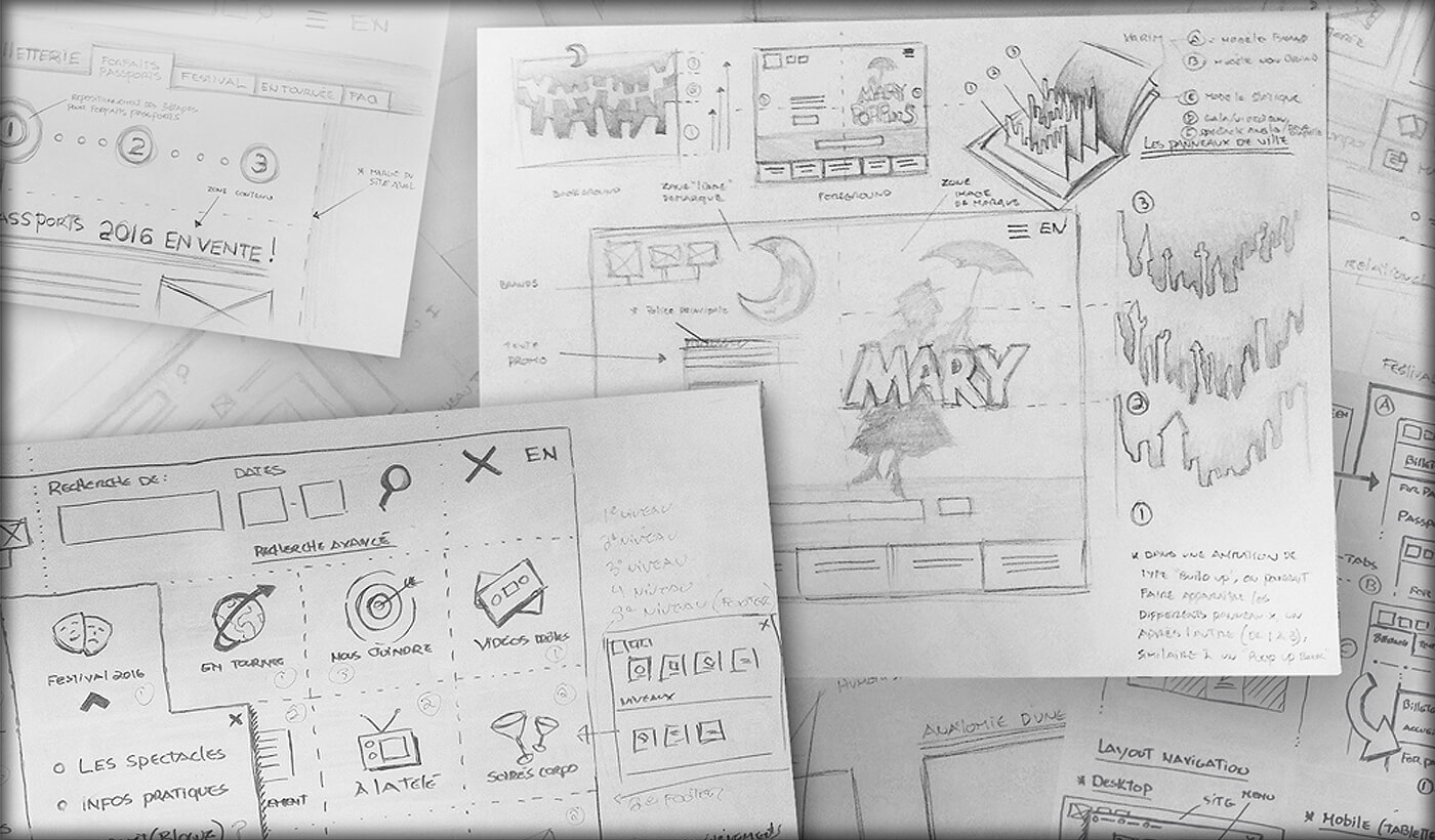
As soon as we saw the official promotional material of Mary Poppins, we grasped the potential to make a splash on the future website’s home page. The grandiose theme and its reputation deserved nothing less.
The first step was a deconstruction. A bit like a novel where the story is conceived from the end to the beginning, we peeled the elements of the concept to the core to create an evocative journey that sets the tone and immerses the viewer in the Mary Poppins experience.
Our brainstorming session quickly gave way to early drafts of what the homepage would become. Content first, but above all, we wanted to develop a full experience for spectacular shows.
Through skits, prototypes, models, and finally animation, we gave life to the concept to produce the version you now see online.
Finally, the Just for Laughs experience is a one of a kind digital platform among all festivals. Like us, Just for Laughs is delighted with the results and we sincerely believe that it has its place on the podium of experiential websites of the year.