Here is our TOP 5 of the Best Mobile Applications regarding the UX Design.
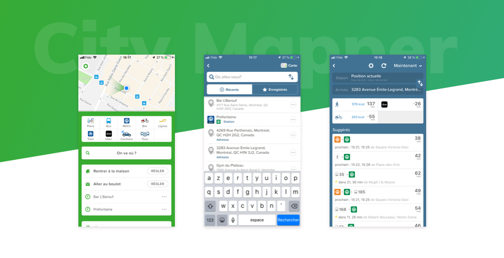
- 1- City Mapper: the ultimate urban mobility!
– The most recent trips are displayed and saved in the application and offered first in the list during a new search
– Clear and simple display of the different means of transport to arrive at your destination with an indication of the approximate time
– Real time display of bus and train times and display of alerts if there are transport problems.
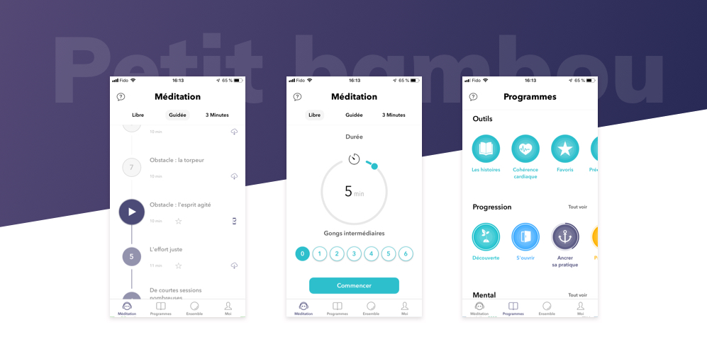
- 2- Small bamboo: stay zen!
– Very simple switch between the three modes of meditation (Free, guided, 3 minutes). For guided meditations, the user follows a clearly defined thread.
– The adjustment of the duration of meditation is very simple, we use his finger to gauge the duration, the interaction is fast and pleasant.
– The choice of programs is clearly sorted with a horizontal scroll allowing to see many quickly.
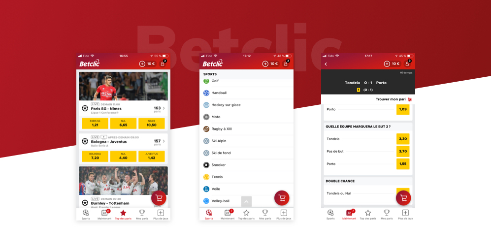
- 3- Betclic: You bet!
– The UX remains simple and obvious while the number of data is relatively important (large number of possible betting combinations).
-We offer big posters, and sorting by simple sport. Finally we can see all the possible bets by entering the details of a bet.
– The Sticky Basket button makes all the difference since it allows us to quickly check our wagering combinations and then validate easily.
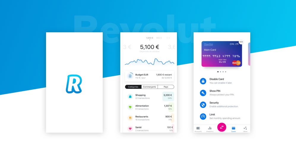
- 4 – Revolut: So much better than just a bank!
– The user experience is really intuitive in Revolut. An expense notification is received after each card payment, and the account balance is automatically refreshed on the main app screen.
– Sorting by category of purchase is automatically done by Revolut, it allows to know at a glance in what we have spent the most and how to achieve better savings in each area. (Screen 2)
– If you lose your credit card Revolut, it is very easy to block his card and then reactivate it. The card quick screen switch is also very well thought out and intuitive for the user (Screen 3)
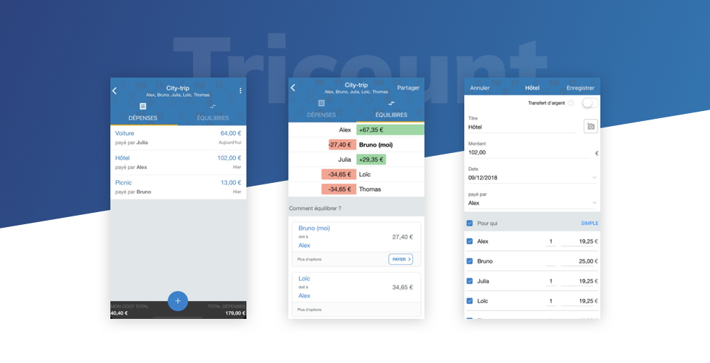
- 5 – Tricount: Good Accounts Make Good Friends
– The Interface is as a whole simple and uncluttered. The button to add an expense is clearly an added value because it is always accessible and visible when you arrive.
– How to balance accounts is Tricount’s # 1 asset. We know how much we owe to someone with a call to action to pay when we are concerned
– In the opposite direction, when an expense is added, being able to check and uncheck the people concerned by the expense is wise.