What Is a Style Guide?
The style guide of a website is the equivalent of its graphic charter for the developers. It contains the style of different types of HTML elements such as titles, paragraphs, lists, buttons, as well as all generic elements such as colours and fonts used.
Why a Style Guide?
Collaboration Without Exception
The style guide allows uniformity in the rendering of the website. It limits the management of exceptions and turns out to be very useful during the development of the website.
When building a site as a team, the style guide allows for standardization. For example, a button will have this or that default visual style. Whoever will work on the site will use this style guide and contribute to it with new elements that could be reused on the site. Hence, this synthesis allows developers to group and standardize generic elements.
A Unified Brand
The style guide reflects the branding. It serves as a reference. On the development side, this avoids duplicate declarations in the CSS and thus facilitates site maintenance.
A Style Guide That Evolves
The team of designers and developers may decide to modify it along the way. In addition to the basic elements, they can integrate mini modules if they recur on different pages.
Problems Encountered in the Absence of a Style Guide
The design team develops the style guide as soon as the first models are ready (even if it is built up as it moves along). It can therefore allow validation upstream of the font used, for example. Developers can also anticipate integration challenges of certain visual elements.
Style Guide Generator
To get rid of potential problems, we decided to develop a style guide editor and visualization tool with Sass export functionality. For those who don’t know, Sass is a programming language for generating CSS style sheets.
We chose to develop our own tool to customize it to our liking and evolve it according to our needs. To allow certain graphic elements to be validated within a web page, the style guide generator offers the possibility of readjusting the styles before all the models are available. We can then validate the rendering of a used font or compare the difference between Mac and Windows.
To push the tool further, we developed the Sass export of the style guide. First, we enter the values of the styles (available in the three responsive resolutions). Then, we export everything to a .scss sheet that we integrate into our project.
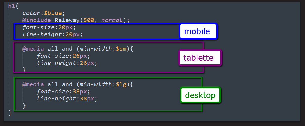
3 resolutions
The Style Guide must include item styles (including sizes) in three resolutions for mobile, tablet, and desktop formats. For example, a <H1> title will not necessarily have the same size in mobile as in desktop.
By specifying the size of this title in the different targeted resolutions in our style sheet, we anticipate any problem. If the <H1> default values are not specified in our style sheet, they will inherit those of the CSS framework used (Bootstrap in our case) or even that of the browser.
In Bootstrap’s 4th version, which should be released soon, we will be able to directly integrate our default styles by customizing the Sass variables as is the case for Less in version 3.
Lengthy to Implement? Not necessarily
Integrating the style guide may seem like a hassle, but it’s quite the opposite. We save time before the development of the different page templates. The new pages or sections will then be easier to develop because they will inherit a base of styles.
The Style Guide, Highly Recommended
The style guide is proving to be of tremendous importance when creating or redesigning a website. It defines the framework at the graphic level of the generic components of a website. Coupled with the use of Sass thanks to the defined variables, it is even more efficient.
For more on Digital Marketing, do not hesitate to contact our Web Agency.


